The Swiss are divided into two groups: those who shop at Migros, and those who shop at Coop.
These two competing supermarket chains have near total dominance in the country, but what determines whether someone is a Migros or Coop shopper is how close they are to the nearest supermarket. Using Python, we can visualize this balance across Switzerland.

In this tutorial, I will show you how you can build a similar catchment area map for yourself with any list of data points.
1. Let’s Import some Libraries
First we start with a new python file and we will import the following libraries.
import pathlib
import geopandas
import numpy as np

from shapely.ops import nearest_points
from shapely import distance

import matplotlib.pyplot as plt
from matplotlib.colors import LinearSegmentedColormap
from matplotlib.colors import ListedColormap
import matplotlib.colors as clr
import matplotlib as mpl

from PIL import Image
We’ll use Pathlib to resolve our paths, Geopandas for our databases, Shapely for some measurement tools, Matplotlib to draw the figure and PIL to open an Image for our custom colorbar.
2. Let’s Import some Data
Now we will set out working directory and you will need to collect you data. We will create Geopandas dataframes of Coop locations and Migros locations. Then We have a shapefile of Switzerland, which has been gridded into 5 km square grids from swisstopo and finally, we have a shapefile of the canton boundaries from swisstopo used for the final graph.
Note that you can select the layer from a .gpkg with the keyword “layer”.
DATA_DIRECTORY = pathlib.Path().resolve() / "Data"

coop_locations = geopandas.read_file(DATA_DIRECTORY / "geocodedCoop.gpkg")
migros_locations = geopandas.read_file(DATA_DIRECTORY / "geocodedMigros.gpkg")
switzerland = geopandas.read_file(DATA_DIRECTORY / "griddedSwitzerland.gpkg")
switzerland_cantons = geopandas.read_file(DATA_DIRECTORY / "swissBOUNDARIES3D_1_5_LV95_LN02.gpkg", layer="tlm_kantonsgebiet")
Our data for the Coop/Migros locations is rather simple: a name, longitude, latitude, and a shapely Point for each Coop/Migros .
	coop_locations.head()

	name	lon	lat	geometry
0	Coop	8.969868	47.225154	POINT (8.96987 47.22515)
1	Coop	8.542161	47.376732	POINT (8.54216 47.37673)
2	Coop	8.530546	47.340070	POINT (8.53055 47.34007)
3	Coop City	8.537672	47.372970	POINT (8.53767 47.37297)
4	Coop	8.724530	47.241531	POINT (8.72453 47.24153
Our gridded data ‘geometry’ column in the switzerland dataframe, is a series of 5 x 5 km polygons across the country.
switzerland['geometry']

0        POLYGON  ((2486410.215 1110268.136 , 2...
1        POLYGON  ((2486410.215 1111268.136 , 24...
2        POLYGON  ((2486410.215 1111268.136 , 24...
3        POLYGON  ((2486410.215 1117268.136 , 2...
4        POLYGON  ((2486410.215 1117268.136 , 2...
Now, let’s clean some data and make sure our coordinate reference systems (CRS) all match between the files. Then we make a unary_union of all the Coop and Migros points. After that we specify that the Switzerland shape only includes Switzerland (because in the swisstopo file, some shapefiles from Germany and Italy are included) by setting ‘icc’ == ‘CH’.
coop_locations = coop_locations.to_crs(switzerland.crs)
uu_coop_locations = coop_locations.unary_union
switzerland = switzerland.loc[switzerland["icc"]=="CH"]

migros_locations = migros_locations.to_crs(switzerland.crs)
uu_migros_locations = migros_locations.unary_union
3. Define our nearest neighbors functions
First, we define a ‘centroid’ column in the Switzerland dataframe, which is the .centroid of each 5 x 5 km grid cell.
Then we define a function to use Shapely’s nearest_points method to find the nearest geometry between that centroid and the unary union of all the Coop or Migros locations. We write two functions here to keep Coop locations separate from Migros locations.
Then we return the distance between the centroid and the nearest geometry within the unary union, and store it in a ‘nearest_supermarket’ column. Take note to return [1] of the nearest_geoms.
We keep a print statement so we can keep track of the progress.
switzerland["centroid"] = switzerland["geometry"].centroid

def get_nearest_values(row):
    nearest_geoms = nearest_points(row["centroid"], uu_coop_locations)
    print(nearest_geoms)
    return distance(row["centroid"], nearest_geoms[1])

def get_nearest_valuesm(row):
    nearest_geoms = nearest_points(row["centroid"], uu_migros_locations)
    print(nearest_geoms)
    return distance(row["centroid"], nearest_geoms[1])

switzerland["nearest_coop"] = switzerland.apply(get_nearest_values, axis=1)
switzerland["nearest_migros"] = switzerland.apply(get_nearest_valuesm, axis=1)
4. (Optional) Create a color bar in the style of the Economist
I’m terrible with colors, so why reinvent the wheel. The Economist makes create maps, and their color schemes are top-notch and that’s what we’re going to make here.
#Set our tick marks in meters based on our data
bounds = [0,1000,5000,10000,25000,60000]
#Choose the colors from and to along the gradient
economist_blue_gradient = ["#FBE7C6","#02537A"]
#Create a LinearSegmentedColorMap based on our gradient
economist_blue = LinearSegmentedColormap.from_list("Economist_blue", economist_blue_gradient, N=20)
#Normalize the linear gradient between your bounds
normBounds = clr.BoundaryNorm(bounds, economist_blue.N)

#Now we plot the figure to check it out
#Make a long figure
cbfig, cbax = plt.subplots(figsize=(6,0.5))
#Here we make the initial color bar
cb = cbfig.colorbar(mpl.cm.ScalarMappable(norm=normBounds, cmap=economist_blue),
               cax=cbax)
That’s not great, so let’s add a few attributes to the colorbar figure:
cb = cbfig.colorbar(mpl.cm.ScalarMappable(norm=normBounds, cmap=economist_blue),
               cax=cbax,
               orientation="horizontal",
               ticklocation="top",
               drawedges=True)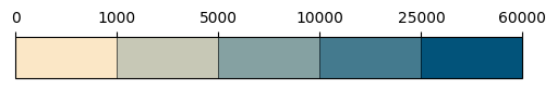
Much nicer, but not there yet. Let’s apply the tick labels we want:
cb.set_ticklabels([0,1,5,10,25,60])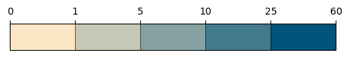
We’re getting there. To finish up we need dividers between the bins, no tick marks, larger labels and to save the file:
cb.outline.set_color("white")
cb.dividers.set_color("white")
cb.dividers.set_linewidth(2)
cb.ax.tick_params(size=0, labelsize=16)
cbfig.savefig('cb.png', bbox_inches='tight')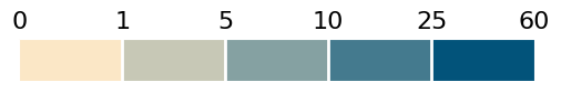
5. Make your map
We now have everything in order, let’s create our map.
Start by making a new figure in Matplotlib, then load the colorbar image if you made it. The colorbar is loaded as an image because it now gives you full control on where to place it over your axes object. So we set it as its own axes object in the figure with fig.add_axes and position it in the top left.
We turn off antialiasing, because the entire Switzerland shapefile is gridded (there are thousands of square polygons), otherwise you end up seeing tiny white lines across the image with antialiasing on.
fig, ax = plt.subplots(figsize=(13,13))
#Load your colorbar image
cb = np.asarray(Image.open("cb.png"))

#Plot you data, in this case the 'nearest_Coop' column, using your cmap, and normalization bounds.
swissmap = switzerland.plot(ax=ax,
                      column="nearest_coop",
                      cmap=economist_blue,
                      norm=normBounds,
                      antialiased=False)

#Position and add the color bar and remove its axis
ax_image = fig.add_axes([0.12,0.58,0.21,0.21])
ax_image.imshow(cb)
ax_image.axis("off")

#Plot the outlines of the swiss cantons
switzerland_cantons.plot(ax=ax, edgecolor="white", facecolor="none")

#Add your annotations us the xy coordinates of your CRS, in this case EPSG:2056
ax.annotate("Always Nearby", xy=(2467987.8395499997, 1306966.9761), weight='bold')
ax.annotate("Distance from nearest Coop Supermarket, 2024, km", xy=(2467987.8395499997, 1298000))
ax.annotate("Sources: BFS, Swisstopo, Coop", xy=(2467987.8395499997, 1064234.8579), fontsize=9)
ax.annotate("Produced By: Arthur \"Turi\" Adams", xy=(2800000, 1064234.8579), fontsize=9)

#Finally turn off your axis
ax.axis('off')
If you’ve followed up until here, you get an image like the following (for Migros data points):
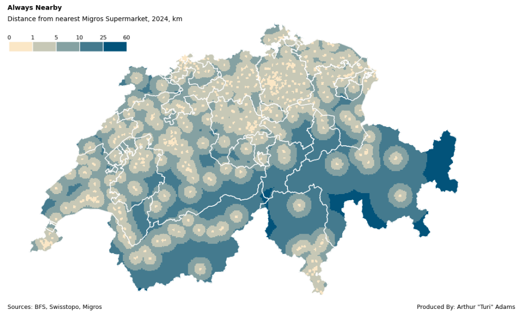
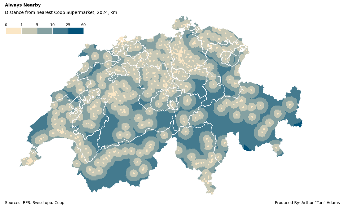
Or as the following for Coop locations, which are more abundant:

What does the data say?
Simply put, you are never far from a Coop/Migros in Switzerland.
On average the nearest Coop is 6.2 km away and the nearest Migros is 7.8 km away. The farthest you can be from a Migros is 51 km in valley of Samnaun and from a Coop only 31 km near the Umbrail Pass, both in canton Graubünden/Grisons. Although this analysis only deals with straight line catchment areas, its a good visualization of the sheer density of these two competing supermarkets.
In the next posts, we’ll be looking at city-specific isochrone mapping of point data i.e. how many minutes away are we by foot/driving to the nearest shop in our neighborhood.
Stay tuned!
Leave a Reply