Since moving to Lausanne from Bern, I’ve felt that my nearest Migros/Supermarket is farther here than it was in Bern.
So I set about to find out!
For this tutorial, we will use Numpy, Pandas, Shapely, Pathlib, Matplotlib, Pyfonts and a network analysis tool called Pandana to build an isochrone walking map of Lausanne.
1. Initiate your project
Let’s import the necessary libraries.
import numpy as np
import pandas as pd
import matplotlib.pyplot as plt
import pandana
import geopandas
import pathlib
import pandana
from pandana.loaders import osm
from shapely import LineString
from mpl_toolkits.axes_grid1 import make_axes_locatable
from pyfonts import load_font
from matplotlib.patches import Patch
Pyfonts is an easy way to manage/import fonts for Matplotlib and Pandana is an efficient network analysis tool that you can use to build isochrone maps. I’ll show you how to use both here.
To install them, run pip install pandana pyfonts in the command line.
Let’s get our data in order by setting our paths with Pathlib, reading in our Coop and Migros locations, a shapefile of Lac Leman, and our map of Switzerland.
DATA_DIRECTORY = pathlib.Path().resolve() / "Data"
coop_locations = geopandas.read_file(DATA_DIRECTORY / "geocodedCoop.gpkg")
migros_locations = geopandas.read_file(DATA_DIRECTORY / "migros_georefed_semifilter.gpkg")
switzerland_gridded = geopandas.read_file(DATA_DIRECTORY / "griddedSwitzerland.gpkg")
lacLeman = geopandas.read_file(DATA_DIRECTORY / 'GEO_LAC_LEMAN.shp')
The next step is to use Pandana to query Open Street Maps, and retrieve the walking nodes and edges within the boundaries of Switzerland.
network = osm.pdna_network_from_bbox(45.818, 5.9559,47.8084,10.4921, network_type='walk')
network.nodes_df.to_csv('nodes.csv')
network.edges_df.to_csv('edges.csv')
all_nodes = pd.read_csv('nodes.csv', index_col=0)
all_edges = pd.read_csv('edges.csv', index_col=[0,1])
In the code above we obtain a Pandana network from a bounding box that represents the lat/long coordinates of Switzerland. The keyword argument network_type specifies the type of network, which in this case will return walking paths. Then the edges and the nodes are saved as CSV files so that we don’t need reobtain the network. Finally I show you how to properly import them as Panda dataframes.
2. Filter your geographical area
lausanne_gemeinde = switzerland_gridded.loc[switzerland_gridded["name"].isin(["Lausanne","Renens (VD)","Pully",'Crissier',"Ecublens (VD)",'Saint-Sulpice (VD)','Chavannes-près-Renens','Prilly','Epalinges'])]

lausanne_gemeinde_unified = lausanne_gemeinde.dissolve()
lausanne_gemeinde_unified = lausanne_gemeinde_unified.buffer(200)
lausanne_gemeinde_unified = lausanne_gemeinde_unified.to_frame()
lausanne_gemeinde_unified.rename(columns={0:"geometry"}, inplace=True)
lausanne_gemeinde_unified.set_geometry("geometry", inplace=True)
Here we choose the target cities for the network analysis, and create a new dataframe from their combined area. I have chosen cities that compose the Lausanne metropolitan area. Then we make it into one shape with dissolve, add a 200 m buffer so that we can capture any Migros/Coop locations that are just out of the area of interest, and convert it back into a dataframe with the correct geometry column.
3. Clean your point source data
#Clean and combine all Coop and Migros Locations in the target area
coop_locations = coop_locations.to_crs(switzerland_gridded.crs)
migros_locations = migros_locations.loc[migros_locations["TYPE"]=="Supermarket"]
migros_locations['name'] = 'Migros'
migros_locations['lon'] = migros_locations['geometry'].x
migros_locations['lat'] = migros_locations['geometry'].y
migros_locations = migros_locations.to_crs(switzerland_gridded.crs)
supermakets_combined = pd.concat([coop_locations,migros_locations])
supermarkets_filtered = supermakets_combined.overlay(lausanne_gemeinde_unified, how='intersection')
Here I just make sure that the Coop and Migros locations have the same CRS, have Lon and Lat coordinates, and then I combine them into one dataframe and intersect them with the unified shape of the metropolitan area that we established in step 2.
4. Filter the nodes and edges within your target area
nodes_in_Switzerland = geopandas.GeoDataFrame(all_nodes, geometry=geopandas.points_from_xy(all_nodes.x, all_nodes.y), crs=lausanne_gemeinde_unified.crs)
nodes_in_Switzerland = nodes_in_Switzerland.reset_index()
nodes_in_lausanne = nodes_in_Switzerland.overlay(lausanne_gemeinde_unified, how='intersection')
edges_in_lausanne = all_edges[all_edges['from'].isin(nodes_in_lausanne['id']) & all_edges['to'].isin(nodes_in_lausanne['id'])]
nodes_in_lausanne.set_index('id', inplace=True)
Let’s go through this code block line-by-line:
- Create a GeoPandas dataframe from our nodes that were saved from Pandana.
- The GeoPandas dataframe’s index is the node id, which we will want later, so we reset_index() to make the id into a column.
- Now we get the intersection between the nodes and the target area, resulting in only nodes within the Lausanne area.
- This step is important: without it the network analysis with Pandana wont work. We need to ensure that all of the edges have matching from and to nodes in our network. If an edge only has one node, it means that its not complete and our network analysis will fail.
- Finally we set the index in the edges to the id column.
5. Create the Pandana network
First we create a Pandana network object with the nodes and edges that have been filtered for the target area. Note that the from, to, and distance columns were already in the CSV file generated by Pandana.
lausanne_graph = pandana.Network(nodes_in_lausanne['x'], nodes_in_lausanne['y'], edges_in_lausanne['from'], edges_in_lausanne['to'], edges_in_lausanne[['distance']])
lausanne_graph.set_pois(category = 'supermarket', maxitems=1, maxdist = 3500, x_col=supermarkets_filtered.lon,y_col = supermarkets_filtered.lat)
results = lausanne_graph.nearest_pois(distance=3500, category='supermarket', include_poi_ids = True)
Then we use the set_pois’ method to connect the points of interest (POI’s) – in this case the supermarket locations – with the nearest node. We set our max analysis distance to 3500 meters. Keep include_poi_ids = True for the next steps that require their ids.
Then nearest_pois() is used to return a dataframe of node id’s, their distance to the nearest POI and the id of the POI. The value for the distance keyword argument must equal the value of the maxdist keyword argument of set_pois.
results.head()
	      1	          poi1
id
172276	657.247009	35.0
172277	766.729980	35.0
280571	935.223999	1.0
280574	752.617981	1.0
280575	860.530029	1.
6. Let’s take a breather
By now we have a dataframe of node id’s, with their distances to the nearest supermarket within 3500 meters. If we stopped here, we could simply plot our nodes on a map and be done with it.
Unfortunately, that doesn’t make a very appealing map. Why? Because nodes are not connected, so you don’t get a nice visualization of the road network.
Instead, we’d like to plot the edges i.e. the roads, and to do that we have to manipulate the data.
7. Preparing to visualize roads
First thing, since we are interested in walking times we need to convert the resulting distances into walking times. Here we take an average walking speed of 5000 m/h.
results[1] = results[1]/5000*60Now we can convert the edge data to paths:
def edges_to_lines(edges_df,nodes_df, results_df):
    edges_and_pois_df = nodes_df.join(results_df).reset_index()
    final_df = edges_df.merge(edges_and_pois_df[[1,'id','geometry']],
    how='left', left_on='from', right_on='id')
    final_df = final_df.merge(edges_and_pois_df[[1,'id','geometry']],
    how='left', left_on='to', right_on='id', suffixes=('_from','_to'))
    final_df['Line_geometry'] = final_df.apply(lambda x: LineString([x['geometry_from'], x['geometry_to']] ), axis=1)
    final_df['Line_value'] = final_df.apply(lambda x: (x['1_from'] + x['1_to'])/2, axis=1)
    final_df = geopandas.GeoDataFrame(final_df,
    geometry='Line_geometry',
    crs='EPSG:2056')
    return final_df

lines_df = edges_to_lines(edges_in_lausanne,nodes_in_lausanne,results)
Here I define a function called edges_to_lines, which takes the edge, node, and results dataframes and returns a merged dataframe of paths.
First we join the nodes dataframe with the results dataframe by their indices, resulting in a dataframe of node’s, their geometries, and distances to POI’s. Then a new dataframe is created from the edges, where we obtain the distance to the POI of both nodes (the from and to nodes) that make up that edge.
Then row-by-row we create a Shapely LineString from the from and to node geometries in a new column. To calculate the average distance of the LineString to the nearest POI, we take the average distance of the from and to nodes that compose the LineString and store its value in the column named “Line_value“.
Finally we convert that all into a GeoDataFrame, set the geometry column and the CRS, and return it.
8. Plotting our final figure
First let’s choose our font using Pyfonts:
font = load_font('https://github.com/google/fonts/blob/main/ofl/oswald/Oswald%5Bwght%5D.ttf?raw=true')
font.set_size(18)
Pyfonts returns a FontManager singleton from the google fonts github repository. Find the font in https://github.com/google/fonts/tree/main/ofl, then copy the link to the font e.g. https://github.com/google/fonts/blob/main/ofl/aboreto/Aboreto-Regular.ttf and add ?raw=true to the URL like in the code above. We also set the font size with the set_size() method.
Now to the plot:
#Obtain the boundaries of your image
minx, miny, maxx, maxy = lines_df['Line_geometry'].total_bounds
#Set the figure attributes
fig, ax = plt.subplots()
fig.set_facecolor("#11142a")
plt.gcf().set_size_inches(5.076513*2,3.9*2)
plt.subplots_adjust(left=0, right=1, top=1, bottom=0)
#Choose your color map
cmap = plt.cm.Spectral_r
#Choose the Patches, i.e. the colored blocks, for your custom legend
legend_elements = [Patch(facecolor=cmap(0.125), edgecolor=None, label="5 Min"),
Patch(facecolor=cmap(.5), edgecolor=None, label="20 Min"),
Patch(facecolor=cmap(1.), edgecolor=None, label=">40 Min")]
#Set your ax limits
ax.set_xlim(minx, maxx)
ax.set_ylim(miny, maxy)
ax.set_axis_off()
#Plot your edges
lines_df.plot(ax=ax,
column='Line_value',
cmap=cmap,
alpha=0.6,
linewidth=0.6,
vmin=0,
vmax=40)
#Plot the lake
lacLeman.plot(ax=ax,
facecolor="#032a4b")
#Annotate
ax.annotate("Lausanne",
(2531000,1160500),
color="White",
fontsize=25,
font=font,
weight='bold' )
ax.annotate("A walk to your nearest supermarket",
(2531000,1159800),
color="White",
fontsize=12,
font=font,
weight='bold' )
#Configure your legend
ax.legend(handles=legend_elements,
title='Walking times',
alignment='left',
title_fontproperties=font,
loc='lower right',
framealpha=0,
labelcolor="White",
prop=font)
ax.get_legend().get_title().set_color('White')
ax.get_legend().get_title().set_fontsize('24')
plt.legend
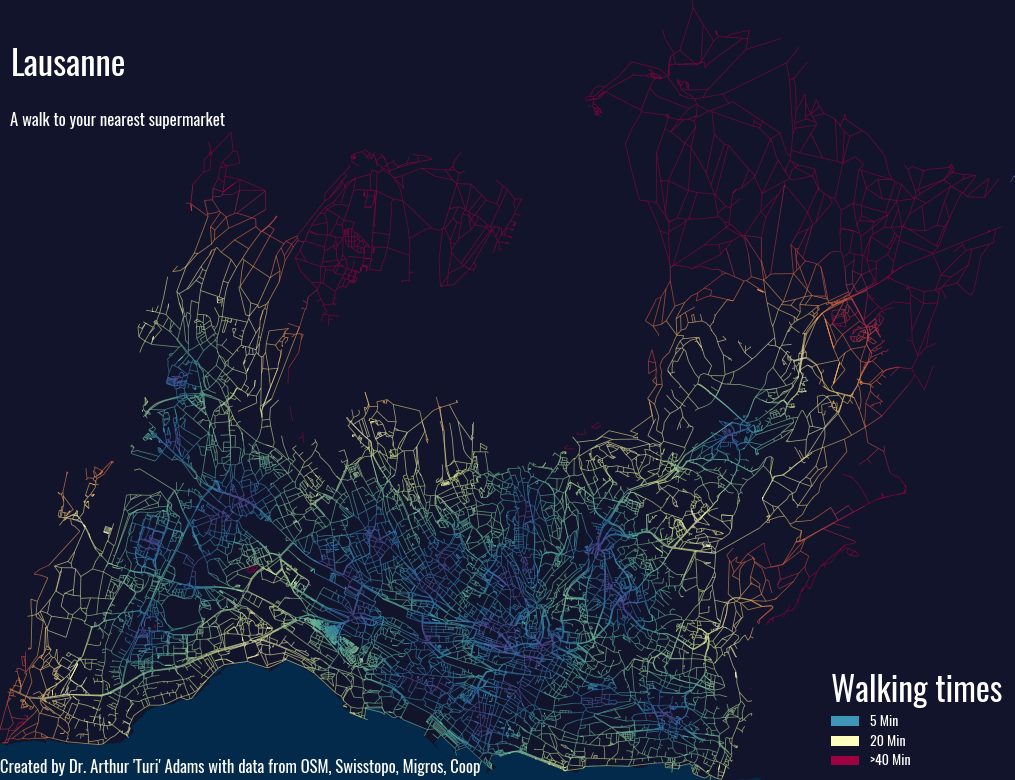
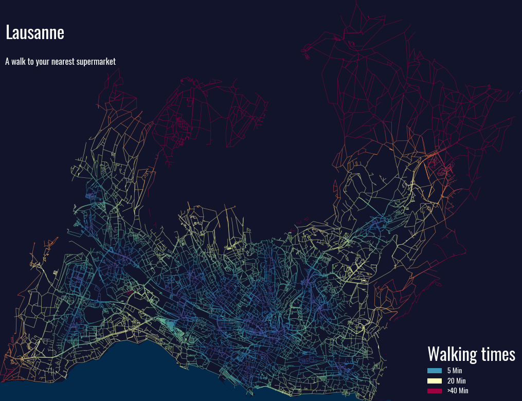
plt.savefig('LausanneWalkingDistances.png')Let’s go through all of the code blocks here so you understand what’s going on.
First we obtain the total bounds of the edges to define the plot area, we set the background color (i.e. the facecolor), then we do something funny: we set the figure size_inches to 5.076513*2,3.9*2, and we adjust the subplots by a curious value of (0,1,1,0).
Here’s what it looks like when we #comment out those two adjustments.
Look at all that excess Matplotlib padding! We remove it by setting the aspect ratio to match our map boundaries:
(maxx-minx)/(maxy-miny) = 1.301679529279719
5.076513*2,3.9*2 = 1.30167
The multiplier of *2 makes the figure twice as large. Then the subplots_adjust method “magically” removes the final bit of padding on the image.
The color map is a standard one in the Matplotlib library, which is reversed with the “_r” suffix.
Legend_elements refers to the small boxes, known as Patches, that we use to create a custom legend. For each Patch, we map the facecolor to a color that represents a value on the colormap e.g., facecolor=cmap(1.) means take the color at the farthest point (100%) on the right of the colormap.
Next we plot our edges, and here there is nothing of note except for the keyword arguments of vmin and vmax. These are for the colormap, and they tie values explicitly to the colormap. vmin=0, vmax=40 means that 0% on the colormap indicates distances/times that equal 0, and the 100% on the colormap represents distances/times that are >=40.
Finally, to configure the legend we assign the legend_elements to the handles keyword and we pass the Pyfonts font to the prop keyword.
Afterwards we have to get the legend and set the title color to White manually, and set the title font size manually as well. This stems from using the props keyword in ax.legend.
With that done, we plot the legend and save the figure, and we’re wrapped up!
9. Wrapping Up
The quickest way to examine the data is to simply run describe() on our results table:
results[1].describe()

count    33628.000000
mean        11.016890
std          9.660926
min          0.000000
25%          4.732113
50%          8.075664
75%         13.570008
max         42.000000
Name: 1, dtype: float64
The mean walking time from any path to a Coop or Migros in Lausanne is about 11 minutes, and about 50 % of all paths are with 8 minutes to one of the supermarkets, which isn’t too bad. What this data doesn’t account for, and will be the subject of the next tutorial, is elevation. Lausanne is a terribly hilly city, which results in some rather tiresome and slower walks to get to your destination. The next iteration of this map, and the subsequent maps, will use the elevation of the nodes to calculate the new walking times.
That said, the density of Coop/Migros locations precludes any major changes to the walking speeds especially since most Coops and Migros do not tend to be nested on top of local high points. The next map will also feature a difference map between the two analyses to see what the resulting change is.
From the map we see three distinct zones that are underserved: (1) the shoreline of Lausanne with the exception of Ouchy, which features a supermarket by the Metro line, (2) St. Sulpice – whose closest supermarkets are the Migros in Preveranges and the Migros at EPFL, and (3) the upper reaches of Lausanne (to which I don’t know what to call, if a local could chime in), which are served by one supermarket in Epalinges.
The next step is build on these maps, and see which Swiss metropolitan area is best served. So stay tuned for the next post!
Leave a Reply